Wedding decoration refers to all the visual, material, and sensory choices that shape the atmosphere of a ceremony and reception. Color palette, textures, lighting, furniture, floral arrangements: each element contributes to an overall coherence. For several seasons now, the trend has shifted away from static decor to favor a scenographic approach, where each space traversed by guests tells a part of the day’s story.
Wedding decoration designed as a guest journey
Most wedding decoration guides focus on objects: centerpieces, arches, signage. This approach overlooks a crucial parameter: the flow of guests through the space. An elegant wedding is first built by connecting the different areas through a continuous visual and sensory logic.
Concretely, this means thinking of the decoration as a succession of micro-scenes. The welcome area sets the tone with a colorful first contact (vegetal garland, calligraphed sign, diffusion of an ambient fragrance). The passage to the ceremony extends this atmosphere with a path marked by lanterns or petals. The reception carries the same shades and materials, with an increase in intensity in lighting and floral volumes.
This logic of experiential journey helps avoid the pitfall of “beautiful but disjointed.” Instead of choosing isolated decorative elements, one starts from the layout of the venue to create a guiding thread. Finding coherent inspirations for each stage requires consulting catalogs structured by themes: wedding decoration on Cœur de Mariage groups ranges designed to articulate ceremony and reception within the same aesthetic framework.
Color palette: the retreat of all-white and bold shades
All-white has long been synonymous with wedding elegance. Recent trends show a clear shift towards bold and assertive colors: butter yellow, Klein blue, deep terracotta, sage green. These shades bring personality without sacrificing sophistication.
Adopting a colorful palette does not mean overloading. The principle remains to limit the number of colors to a maximum of three:
- A dominant color that dresses large surfaces (tablecloths, drapes, arch) and represents about two-thirds of the visible palette.
- A secondary color for structural details (napkins, ribbons, stationery, candles).
- A metallic or neutral accent (matte gold, brass, raw linen) that connects the first two without creating a harsh contrast.
Terracotta combined with ecru linen and touches of brass works particularly well in a stone or wooden venue. The more unexpected butter yellow suits outdoor receptions and gives floral arrangements (ranunculus, dahlias) a natural brightness.
Flowers, textures, and materials: creating depth on the reception table
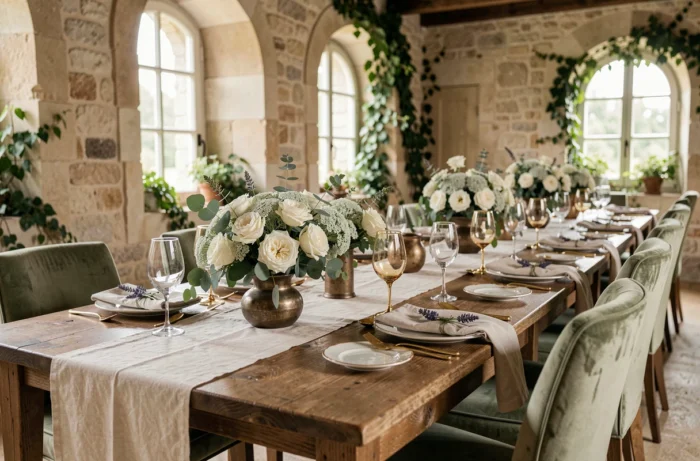
An elegant centerpiece does not rely solely on flowers. Visual depth comes from the contrast between materials. Combining blown glass, raw wood, crumpled fabric, and matte ceramics in the same arrangement creates a relief effect that identical aligned vases will never produce.
Floral arrangements mixed with fruits and foliage are gaining ground. Citrus, figs, or pomegranates integrated into bouquets add volume, saturated colors, and an unexpected touch that breaks away from purely floral centerpieces. The cost remains comparable, if not lower, as fruits replace some of the cut flowers.
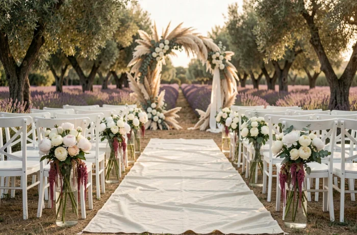
For the ceremony, asymmetrical vegetal arches are gradually replacing classic symmetrical structures. An arch where the foliage concentrates on one side, with pampas or wisteria draping down, creates a more dynamic photographic frame than a uniformly adorned semicircle.
The underestimated role of lighting
Lighting transforms a mundane room into a memorable space. Filament garlands draped above tables, pillar candles of varying heights, spotlights directed at floral arrangements: light creates the visual hierarchy of the venue. Without lighting work, even a carefully curated decoration appears flat in the evening.
Flickering flame LED candles now offer a look very close to traditional candles, without the risk of fire or restrictions from the venue. They allow for the installation of light points in areas where wax would be prohibited (stairs, window sills, hanging fixtures).
Stationery and signage: details that structure elegance
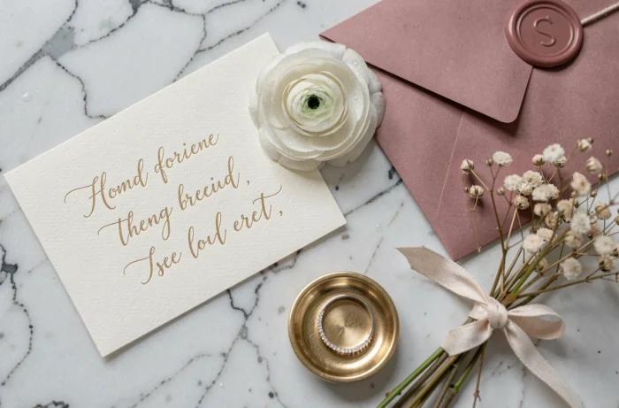
Wedding stationery goes beyond just invitations. Table plans, place cards, menus, ceremony booklets: these supports contribute to decorative coherence. Textured paper (cotton, laid) with a simple typography and a subtle reminder of the chosen palette is enough to anchor the theme.
Signage guides guests as much as it decorates. A calligraphed directional sign on clear acrylic, a vintage engraved mirror for the table plan, linen tags for place cards: these functional elements become points of visual interest.
- Favor a single typographic style across all printed materials to maintain coherence.
- Match the ink color to the overall palette (gold ink on terracotta background, black ink on cream background).
- Opt for varied formats (square for the menu, rectangular for the program) to break monotony without disrupting graphic unity.
Stationery is also the area where handmade remains most accessible. Even without calligraphy skills, personalized stamps or a simple colored wax seal on a kraft envelope provide a perceptible artisanal finish.
An elegant wedding relies less on budget than on the rigor of the guiding thread. Three mastered colors, lighting designed for the evening, materials that respond to each other from one space to another, and coherent stationery are enough to transform an ordinary venue into a striking decor. The final detail not to overlook: plan a site visit, both day and night, to adjust volumes and lighting before the big day.